Turkish abstract painting grew from a distinctive blend of modernism and deep-rooted regional aesthetics—Iznik tile palettes, Ottoman-Islamic ornament, calligraphic forms, marbling (ebru), and kilim geometry. For appraisers and collectors, a “Turkish local abstract painting” often presents as an unsigned or lesser-known work sourced in Turkey or from diaspora collections, carrying stylistic signals that warrant careful analysis. This guide lays out the features, evidence trails, and common pitfalls to help you evaluate authenticity, quality, condition, and market positioning.
Turkish Abstract Art in Context: What “Local” Usually Means
Modern abstraction in Turkey consolidated in the mid-20th century, as artists engaged with global avant-garde trends while reframing decorative and spiritual traditions:
- Early pathways: Artists connected to Istanbul’s Academy of Fine Arts and the Paris scene (notably members of the École de Paris) absorbed cubism, expressionism, and lyrical abstraction.
- Calligraphic abstraction (hurufiyat): Painters reinterpreted Arabic/Ottoman script as form rather than legible text, producing rhythmic, gestural compositions.
- Geometric-minimal strains: Some artists pursued restrained geometry and monochrome or limited palettes, echoing both international minimalism and Islamic architectural proportions.
- Urban and textile inflections: Others merged abstract language with Istanbul’s skyline grids, worn wall textures, or kilim-like modular order.
“Local” generally indicates a work made in Turkey or by a Turkish artist working domestically (often shown in Istanbul or Ankara galleries) without immediate recognition on the international stage. Such works may show strong regional visual DNA but lack the documented track record of major names. For appraisal, this means heavier reliance on physical inspection, provenance, and stylistic consistency.
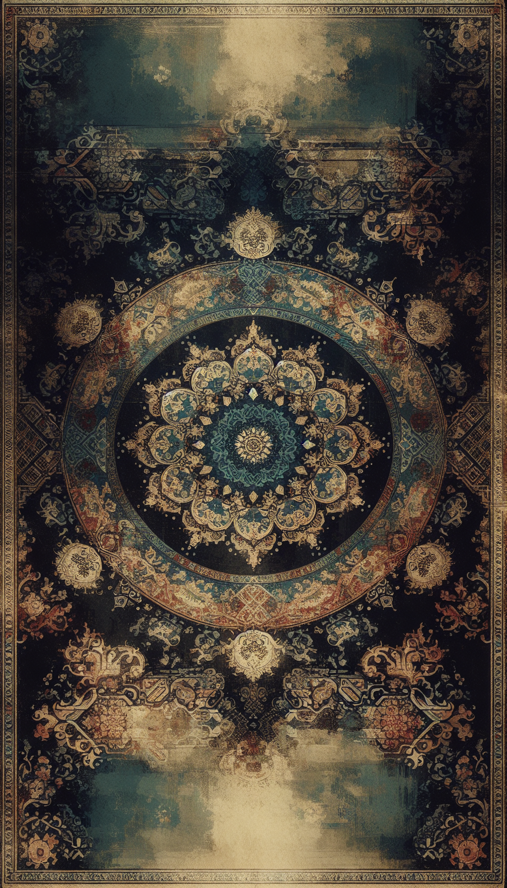
Telltale Visual Cues: Palette, Motifs, and Composition
While Turkish abstract art is diverse, the following cues recur frequently. Look for combinations rather than single traits.
- Palette influenced by Ottoman ceramics and illumination:
- Cobalt and ultramarine blues, turquoise, and teal.
- Coral red or “Armenian bole” variants paired with white and black.
- Gold leaf or gold paint accents reminiscent of manuscript illumination (tezhip).
- Calligraphic or pseudo-calligraphic gestures:
- Sweeping black lines in ink or thinned paint, sometimes layered beneath color fields.
- Fragmentary letterforms that look like Arabic/Ottoman script but are non-legible design.
- Geometric structuring:
- Star polygons, interlaced bands, or tiled grids evoking Seljuk or Ottoman ornament.
- Medallion-like centralization or border logic echoing carpets and manuscript pages.
- Surface effects tied to local traditions:
- Ebru-inspired veining and marbled swirls.
- Collage textures referencing urban walls: aged posters, newspaper fragments in Turkish, stenciled numbers.
- Cityscape abstractions:
- Dense linear webs hinting at Istanbul’s aerial map—bridges, Bosphorus curves, clustered neighborhoods.
- Gesture and material density:
- Palette-knife impasto in oils (1960s–1980s studio practice common).
- Acrylics with modeling paste or sand for relief, especially from the 1970s onward.
Crucially, quality examples show a coherent visual logic—rhythm, balance of positive/negative space, and a purposeful relationship between motif and field.
Materials and Construction: Back-of-Work Forensics
Material and support clues are critical for dating and localization.
- Supports:
- Canvas: Cotton or linen; 20th-century Turkish canvases often hand-stretched with wooden keys. Check edges for original tacking and unpainted turnover.
- Boards: Masonite/hardboard common from the 1960s; sometimes locally sourced with maker’s stamps in Turkish.
- Paper: Heavier “bristol” card (often labeled “bristol karton” locally) for gouache/ink; imported watercolor papers (Arches/Fabriano) also appear.
- Media:
- Oil: Traditional for earlier modern works; look for natural resin varnishes that may have mellowed.
- Acrylic: Increasingly prevalent post-1970; matte to satin surfaces; faster drying drips.
- Mixed media: Gold leaf over bole or acrylic adhesive; charcoal/ink calligraphy beneath paint; collage of Turkish newspaper or ephemera.
- Edges and verso:
- Frames: From simple strip frames to Ottoman-style gilded frames used for contrast; not always original.
- Labels and stamps: Gallery labels in Turkish (Istanbul/Ankara addresses), exhibition numbers, hand-written titles like “Kompozisyon,” “Soyut,” “Istanbul,” “Derviş.”
- Date formats: Day.Month.Year (e.g., 12.05.1978) or Year only; “’70” shorthand.
- Supplier marks: Local art shop tags or Turkish customs stickers can signal domestic sale and travel.
Note telltale anachronisms: water-based acrylics marketed in Turkey became widespread later than oils; heavy fluorescent pigments generally indicate late-20th-century or newer.
Signatures, Inscriptions, and Provenance: Reading the Paper Trail
Signature behavior varies:
- Scripts and alphabets:
- Post-1928, artists overwhelmingly signed in the Latin-based Turkish alphabet. Expect diacritics (Ç, Ş, İ, Ö, Ü) in titles and dedications.
- Calligraphic abstraction may include Arabic-script shapes; these are typically design elements, not signatures.
- Placement and form:
- Lower corners in oil and acrylic; verso signatures on paper works.
- Monograms or initials are common; compare handwriting across dated works when possible.
- Language:
- Titles in Turkish (“Soyut Kompozisyon,” “Mavi Kompozisyon,” “Hat”) or occasionally French/English depending on exhibition history.
- Dedications: “Sevgili …” followed by a name; can be strong authenticity markers if the recipient is traceable.
- Gallery and exhibition documentation:
- Invoices from Istanbul/Ankara galleries, stamped with company seals.
- Exhibition checklists, catalogues, or wall labels retained by owners.
- Auction tickets from domestic houses; lot stickers on verso stretcher bars.
Provenance that links the work to named exhibitions, established galleries, or known collectors significantly raises confidence. Photographs of the piece hanging in situ with dateable context can be persuasive secondary evidence.
Dating, Attribution, and Avoiding Missteps
Attributing a Turkish local abstract painting is an evidence-led exercise:
- Stylistic triangulation:
- Compare motifs, palette, and structure to established schools or artists—calligraphic abstraction vs geometric minimalism vs urban-textural abstraction.
- Ask whether the hand shows a consistent visual grammar across line, color, and space.
- Material dating:
- Acrylic-only layers are seldom earlier than the 1950s; widespread Turkish studio use grows from the 1970s.
- Gold leaf techniques and modern acrylic adhesives can help pinpoint later decades.
- Workshop and student works:
- Turkish academies produced capable student abstractions; these can mimic major names’ styles. Look for academic stamps, student framing, or crit notations on verso.
- Prints vs paintings:
- Serigraphs and giclées can be mistaken for paintings. Use magnification to identify dot patterns, plate indentations, or textural inconsistencies.
- Red flags in forgeries:
- Artificial craquelure on acrylic surfaces; inconsistent aging (pristine verso with “aged” face).
- Vague provenance relying on “purchased in Istanbul bazaar” without gallery names or dates.
- Incoherent signature letterforms relative to claimed artist; wrong diacritics (e.g., “Istanbul” without the dotted İ can be suspicious depending on artist’s habits).
When a plausible attribution emerges, seek a written opinion from a scholar, foundation, or dealer with a track record in the specific artist or school. For high-value works, scientific analysis (pigment ID, binder analysis, IR/UV imaging) is prudent.
Condition and Conservation: Issues That Affect Value
Turkish local abstracts present a familiar roster of condition concerns—some with regional twists:
- Environmental stress:
- Humidity fluctuation can loosen canvases; keys may be missing or dysfunctional.
- Nicotine staining on unvarnished acrylics and paper from domestic settings.
- Surface vulnerabilities:
- Gold leaf lifting or abrasion on edges; gilding is sensitive to moisture and handling.
- Marbling inks (if used) can be water-sensitive; avoid aqueous cleaning.
- Past restorations:
- Overpainting to “embolden” color fields; uneven varnish gloss; discolored synthetic varnishes.
- Lining or patching on oil canvases; check for weave distortions.
- Structural issues:
- Warped hardboard; corner separations in frames; slack canvas.
Conservation notes:
- Dry clean with soot sponges where appropriate; avoid solvents without testing.
- Stretchers with missing keys should be addressed by a conservator; dangerous to over-tighten.
- Consolidate lifting leaf with appropriate adhesives; this is a specialist task.
Condition directly impacts valuation; subtle wear in robust acrylics may be acceptable, but losses in calligraphic lines or gilded passages can be disproportionately damaging.
Market Context and Pricing Benchmarks
The Turkish market has matured, with strong domestic auction ecosystems and international interest. Value bands generally reflect:
- Artist recognition:
- Major names in Turkish abstraction command five to seven figures (currency dependent), while capable local contemporaries often trade in three to low five figures.
- Period and quality:
- Prime-period works, especially large-scale oils or commanding mixed media, outperform later repetitions.
- Provenance and exhibition history:
- Works tied to respected galleries or documented shows attract competitive bidding.
- Medium and size:
- Large canvases typically surpass small works on paper, though exquisite small calligraphic abstractions can punch above weight.
- Currency and location factors:
- Domestic auction prices can be influenced by exchange-rate volatility; use USD/EUR-equivalent comparables for consistency.
For formal appraisals, cite multiple comparables by date, medium, size, and subject affinity, weighting those with the strongest documentation.
Legal and Ethical Notes
Turkey closely regulates the export of cultural property. While modern and contemporary paintings are generally easier to export than archaeological or ethnographic artifacts, documentation, declarations, and permits may be required. Verify current regulations before shipping. Ethically, ensure the painting’s ownership chain is clear and compliant with local and international norms.
Practical Checklist: Rapid Triage for a Turkish Local Abstract Painting
- Photograph front, back, edges, and details (signature, labels, surface).
- Record exact measurements (cm and inches), medium, and support.
- Note palette and motifs: Iznik blues/turquoise, gold, calligraphic gestures, geometric grids.
- Inspect verso: Turkish language labels, dates (DD.MM.YYYY), gallery stamps, supplier tags.
- Verify signature: letterforms, diacritics, placement; cross-check any dedications.
- Test for medium: oil vs acrylic; note varnish presence and gloss.
- Evaluate condition: structural soundness, surface stability, past restorations.
- Gather provenance: invoices, exhibition catalogues, prior appraisals, owner statements.
- Build comparables: same school/period/medium/size with documented sales.
- Decide next steps: expert opinion, conservation, or formal written appraisal.
Frequently Asked Questions
Q: How can I distinguish calligraphic abstraction from literal calligraphy? A: Calligraphic abstraction uses script-like forms as visual rhythm, often non-legible and integrated into color fields. Literal calligraphy prioritizes legibility and letter proportion rules. In abstracts, line pressure varies like painting; in calligraphy, strokes follow canonical sequences.
Q: Is a Turkish gallery label enough to establish authenticity? A: Helpful but not sufficient. Pair the label with a consistent signature, documented exhibition history, invoices, and stylistic coherence. Labels can migrate between works; always corroborate.
Q: Are frames typically original, and do they affect value? A: Many works have later frames. Original period frames with gallery plates can enhance value slightly through context, but condition and authorship outweigh framing. Avoid overrestoring frames that overshadow the painting.
Q: Can I safely clean an acrylic abstract myself? A: Limit to gentle dry methods (soft brush, vulcanized rubber soot sponge) after testing. Water or solvents can dull or lift paint, especially over inks and gold leaf. When in doubt, consult a conservator.
Q: What size and medium details are most critical for valuation? A: Precise dimensions, medium (oil vs acrylic vs mixed media), and support (canvas vs board vs paper) materially affect comparables. Large, confident canvases in the artist’s prime period usually command higher prices than small works on paper or later variants.
By synthesizing visual evidence, material forensics, and paper documentation, you can place a Turkish local abstract painting on firmer ground—whether preparing a formal appraisal, bidding at auction, or building a collection informed by the region’s distinct visual language.