André Collot (1897–1976) occupies a distinctive niche in 20th‑century French printmaking, admired for his sinuous line, tonal mastery, and bibliophile editions. When a print is described as “Don Quichotte Mezzotinte Etching,” it typically signals a mid‑century original intaglio print illustrating Cervantes’ knight-errant, executed in a hybrid technique that blends etched line with mezzotint or aquatint tone. For collectors and appraisers, correctly identifying technique, edition, and condition is crucial to valuation.
This guide clarifies who Collot was, how to recognize his Don Quichotte prints, what “mezzotinte etching” implies, and how to assess authenticity and value.
André Collot at a glance
- French illustrator and printmaker, 1897–1976, active in Paris.
- Known for livres d’artiste (fine press books) and independent print suites.
- Techniques: etching, aquatint, mezzotint, burin engraving, and wood engraving; often combined for rich tonal effects.
- Subjects: classical literature, fables, pastoral and mythological themes, and (famously) erotic suites. His line is elegant and economical; his tonal work imparts soft, velvety shadows.
Collot’s prints were frequently issued as limited editions on quality French papers (e.g., Arches, Rives), sometimes with pencil signatures, numbering, and publisher or printer blind stamps. Many impressions entered the market disbound from illustrated books; others were issued as separate suites on larger sheets with full margins.
Don Quichotte in Collot’s oeuvre
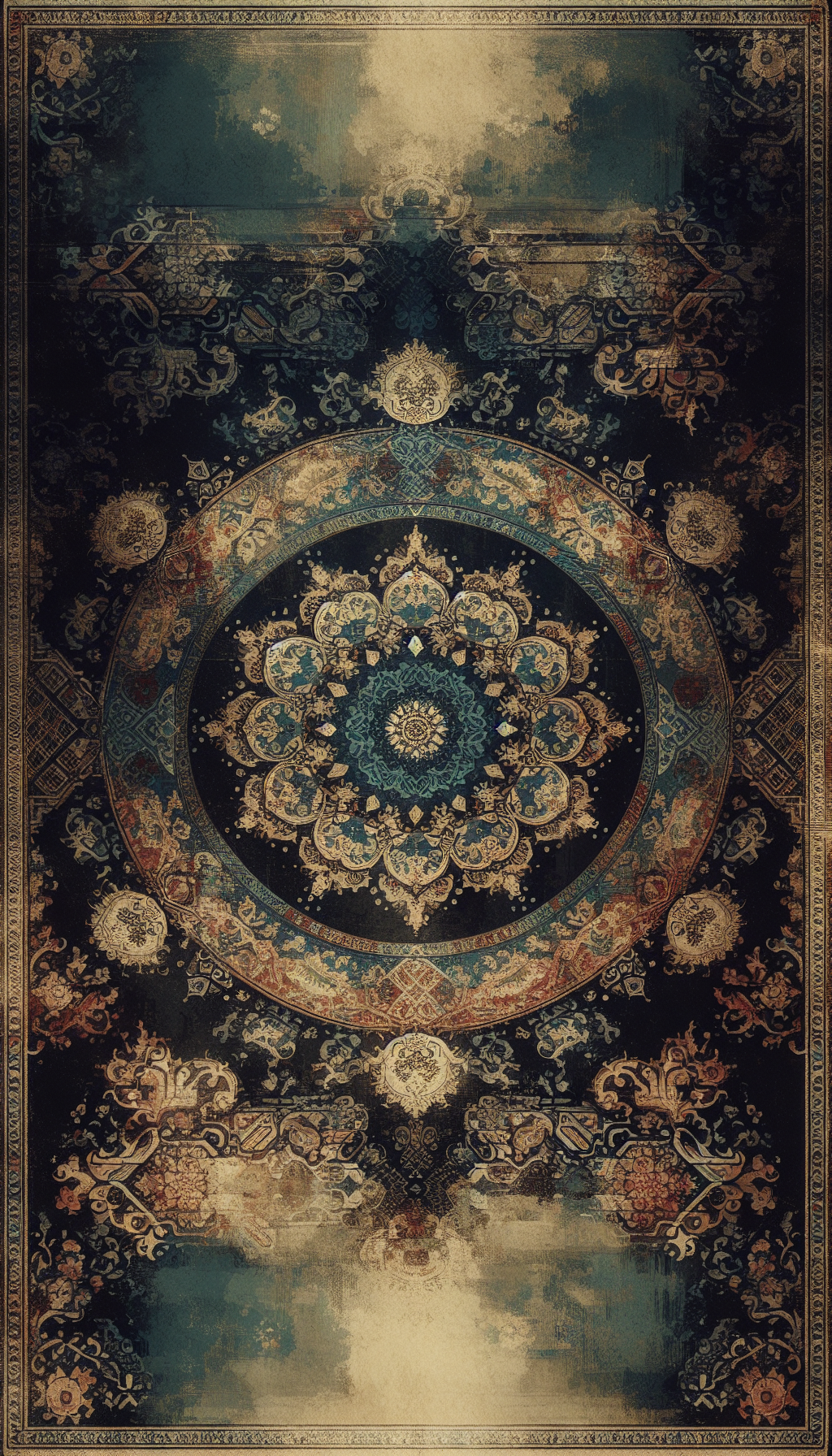
Cervantes’ Don Quixote (Don Quichotte in French) has inspired numerous French illustrators. Collot’s interpretations appear in mid‑20th‑century bibliophile editions and separate plates that depict emblematic episodes: the tilting at windmills, Don Quixote and Sancho Panza on the road, the inn mistaken for a castle, or the penitent’s procession. Hallmarks to look for:
- Thematic focus: narrative vignettes rendered with theatrical lighting; Don Quixote’s elongated form and Rocinante’s bony frame are stylized yet lively.
- Tonal structure: background atmosphere built with mezzotint or aquatint; crisp etched outlines define figures, lances, and accoutrements.
- Plate size: commonly small to medium formats (plate marks often in the 15–30 cm range on the long side), but larger presentations exist in separate suites.
- Captions: some plates carry French captions or are titled in pencil; others are untitled with the subject inferred by imagery.
- Editions: typical mid‑century French limited editions range from roughly 100 to 500 impressions, sometimes with additional artist proofs (E.A. or Epreuve d’Artiste) and hors commerce (H.C.) copies. Not every impression is pencil-signed; book plates, in particular, may bear only a plate signature.
Because multiple French illustrators handled Don Quichotte, attribution must rely on signature habits, line quality, and edition indicators rather than subject alone.
Technique spotlight: mezzotint vs etching (and why “mezzotinte etching” matters)
Terminology can blur. In French, “mezzotinte” refers to the mezzotint process—a tonal intaglio technique prized for deep blacks and soft gradients. Etching, by contrast, creates lines bitten into a metal plate by acid. Artists often combine:
- Etching: linear scaffolding—outlines, hatching, and detail. Under magnification, etched lines have clean, bitten edges and a slight, even width.
- Aquatint: granular tonal fields created with rosin; appears as a fine, even grain in shaded regions.
- Mezzotint: plate roughened with a rocker to carry tone, then burnished back to reveal highlights; produces velvety blacks and a continuous tone without visible grain. Edges of bright highlights look gently feathered.
“Mezzotinte etching” commonly means a hybrid print where Collot etched the drawing and added tonal depth via mezzotint (and/or aquatint). Identification cues:
- Tonal quality: If the darks are luxuriously smooth and the transitions butter-soft, mezzotint is likely present. If tones show a peppery grain, think aquatint.
- Plate tone: Look for intentional plate tone (a veil of ink left on the plate) contributing atmosphere—often used with mezzotint to intensify dusk or interior scenes.
- Plate mark: A rectangular embossing around the image evidences copperplate printing under pressure (intaglio). Photomechanical reproductions lack this impressed bevel.
- Ink: Period impressions typically in black or warm black; occasional sepia. Inking should be crisp with no pixel structure. Under magnification, halftone dots indicate reproduction, not an original print.
Collectors encounter “mezzotint” used loosely in dealer descriptions to mean “tonal intaglio.” Scrutinize the surface to determine whether mezzotint, aquatint, or both were used alongside etching.
Authentication and edition indicators
To distinguish an original Collot Don Quichotte intaglio from a later reproduction:
Signature
- Pencil signature “André Collot” at lower right of sheet margin is a strong indicator of an original limited edition impression.
- Plate signature or monogram within the image is common but alone is not proof of an original print.
- Not all legitimate impressions are pencil-signed, especially those bound in books.
Numbering and inscriptions
- Fractional numbering (e.g., 45/200) at lower left denotes edition size and impression number.
- “E.A.” (épreuve d’artiste), “H.C.” (hors commerce), or Roman numerals for trial proofs may appear.
- Titled in pencil center or left margin is occasionally seen.
Paper and watermarks
- Quality wove papers such as Arches, Rives BFK, or MBM; watermarks are often visible when backlit.
- Deckle edges at one or more sides suggest full or large margins; trimmed sheets reduce value.
Blind stamps and chops
- Rounded or rectangular blind stamps from publishers, ateliers, or galleries may be present near the lower margin or corner.
- Printer chops, if any, support authenticity.
Printing characteristics
- A clear platemark and slight plate-sink within the image area.
- No rosette or dot pattern under 10x magnification.
- Rich, slightly raised ink in dark passages; wiping marks near the platemark may be evident.
Provenance and documentation
- A justification page (for prints extracted from livres d’artiste) can verify edition and paper if retained.
- Invoices, gallery labels, and literature references add weight.
Red flags: glossy paper, offset lithographic dot pattern, absence of a platemark, uniformly flat blacks without intaglio bite, or excessively bright white paper inconsistent with mid‑century stock.
Condition and conservation: what affects value
Print condition significantly impacts the market:
- Toning and discoloration: overall age toning or localized mat burn reduces value; a pronounced “window” line from poor framing is common.
- Foxing and staining: brown spots or tide lines are serious detractions.
- Light-struck fading: if displayed without UV protection, tonal depth can flatten; mezzotint’s richest blacks are particularly sensitive.
- Abrasions and surface rub: over-cleaning can burnish the sheet; scuffs in dark areas are conspicuous.
- Tears, losses, and creases: even small edge tears matter, especially if margins are narrow. Folds through the image are major defects.
- Trimming: loss of full margins and deckle edges diminishes desirability and may remove pencil inscriptions.
- Paper acidity: brittle paper suggests poor storage or non-archival matting; check hinges and tape residue.
- Printer’s creases and inking issues: minor plate tone variations and wiping marks can be inherent and not necessarily faults; excessive plate wear suggests a late pull.
Professional, reversible conservation (light foxing reduction, deacidification, flattening) can improve appearance and value, but invasive bleaching risks paper integrity and can alter inks. Always document treatment.
Market overview and valuation factors
Collot’s market sits within the broader category of 20th‑century French illustrated prints:
- Subject appeal: iconic Don Quixote scenes (windmills, mounted pair in profile) outperform minor episodes.
- Technique: richly printed tonal plates (mezzotint and/or aquatint with strong blacks) tend to bring higher prices than line-only etchings.
- Signature and edition: pencil-signed and numbered impressions on quality paper command premiums. Artist proofs can be attractive, though not inherently more valuable unless scarce.
- Format and margins: larger sheets with full margins, clean watermarks, and deckled edges sell best.
- Condition: fresh, untoned sheets with no foxing or mat burn outperform even rarer impressions with issues.
- Rarity: small editions and early states or trial proofs can be more valuable; documented provenance adds.
- Comparables: prices for Collot’s typical etchings often fall into the low-to-mid hundreds of dollars/euros. Tonal, signed Don Quichotte plates in excellent condition can achieve mid hundreds to low thousands, with exceptional impressions or scarce suites occasionally higher.
Because editions and states vary, recent auction and dealer comparables for closely similar plates (same scene, size, signature status, and condition) are the best benchmark. Avoid over-reliance on retail asking prices; realized prices are more representative.
Care, framing, and storage
- Use 100% cotton rag mat and backing; hinge with Japanese tissue and wheat-starch paste—avoid pressure-sensitive tapes.
- Glaze with UV-filtering acrylic or glass; maintain an air gap between the sheet and glazing with a mat or spacers.
- Frame away from direct sunlight, heat sources, and humidity swings; ideal RH ~45–55%, temperature ~18–22°C.
- Store unframed prints flat in archival folders or solander boxes, interleaved with acid-free tissue; avoid rolling.
- Handle with clean, dry hands or nitrile gloves, supporting the sheet on a rigid board.
Collector’s practical checklist
Confirm technique
- Under magnification, look for a platemark, intaglio ink character, and either velvety mezzotint tone or aquatint grain plus etched line.
Verify authorship
- Pencil signature “André Collot” and, if present, plate signature/monogram; compare handwriting to known examples.
Document edition
- Note numbering (e.g., 34/200), proof inscriptions (E.A., H.C.), and any blind stamps; record watermark and paper type.
Measure correctly
- Record plate (image) size and full sheet size; photograph platemark, watermark, and inscriptions.
Assess condition
- Check for foxing, toning, mat burn, tears, creases, trimming, and inking quality; note verso hinges or residues.
Establish provenance
- Retain book justification pages, gallery labels, invoices, and prior appraisals.
Compare the market
- Seek recent sales of the same scene/plate in similar condition; adjust for signature, margins, and conservation.
Preserve value
- If conservation is needed, get estimates from a qualified paper conservator; keep all treatment reports.
FAQ
Q: Is “mezzotinte etching” a legitimate technique or a mislabel? A: It’s often shorthand for a mixed intaglio print that combines etched line with mezzotint (and sometimes aquatint) to achieve both crisp drawing and rich tone. The combination is common and legitimate.
Q: How can I tell if my Don Quichotte print is an original intaglio or a reproduction? A: Look for an impressed platemark, intaglio ink character, and absence of halftone dots under magnification. Pencil signatures, numbering, watermarks, and blind stamps also support authenticity.
Q: Do lower edition numbers (e.g., 5/200) make a print more valuable? A: Not inherently. Early impressions can sometimes be more richly inked, but number alone doesn’t guarantee print quality. Condition, signature, and tonal strength matter more.
Q: My print lacks a pencil signature—does that mean it’s not original? A: Not necessarily. Plates issued within a bound bibliophile edition may be unsigned in pencil yet still be original intaglios. Evaluate printing characteristics, paper, and edition evidence.
Q: What conservation issues most harm value? A: Significant foxing, mat burn lines, trimming into margins, tears through the image, and light-struck fading. Professional, reversible conservation can mitigate some issues but cannot replace lost margins or heavily faded tone.
A careful, methodical approach—grounded in technique recognition, edition research, and condition assessment—will equip you to appraise André Collot’s Don Quichotte prints with confidence and preserve them for the long term.